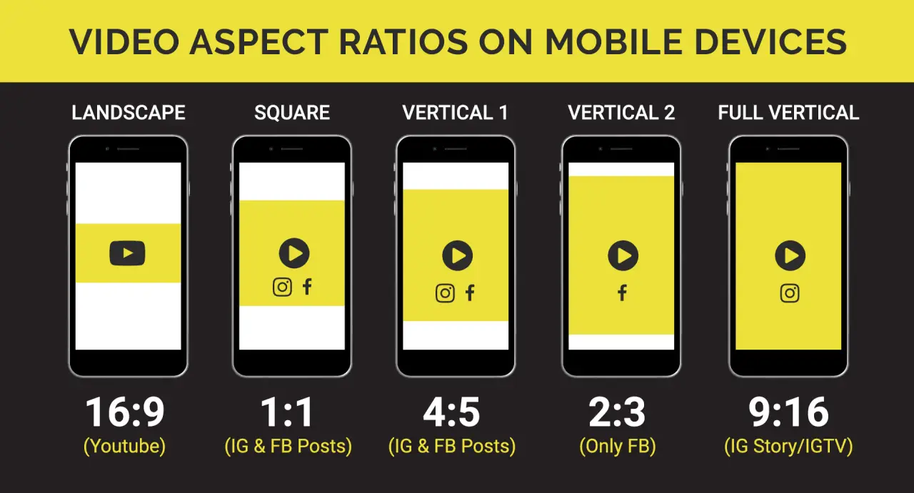
Mobile and Desktop Video Sizes

CMS Max Help Center / Video

Choose the source and crop for the container the video must fill, not one universal pixel dimension.

Use 16:9 as a common landscape starting point, consider a dedicated 9:16 mobile source for portrait compositions, and test real content at each breakpoint.

Mobile and Desktop Video Sizes CMS Max interface and guidance visual
CMS Max help-center reference visual. Verify labels and controls against the current administration interface.

Choose the source and crop for the container the video must fill, not one universal pixel dimension.

Use 16:9 as a common landscape starting point, consider a dedicated 9:16 mobile source for portrait compositions, and test real content at each breakpoint.

Common source strategies

UseStarting ratioWhat to verify
Inline video16:9Player width, captions, controls, and minimum readable size.
Wide background16:9 or wider cropObject-fit cropping, focal point, text contrast, and load cost.
Portrait mobile background9:16 when composition requires itSeparate source switching, focal point, file size, and reduced-motion fallback.

Export checklist

  • Keep essential subjects away from crop-sensitive edges.
  • Use a poster image and meaningful fallback content.
  • Compress to the lowest size that still meets the visual requirement.
  • Test actual phones and slower connections, not only a desktop responsive preview.
  • Do not place essential instructions only inside a silent decorative video.

Turn the guide into a verified website change.

CMS Max can help confirm scope, configuration, integration boundaries, and launch testing for the actual site.

Building Relationships with Web Developers and Marketing Agencies that want better results

The world's fastest and most SEO friendly website code.