CMS Max Design Template & Best Practices (Tailwind v4)
Audience: Designers creating visual comps in Photoshop, Figma, Sketch, or similar for CMS Max sites.
Tech stack: Themes built with Tailwind CSS v4.
1) Philosophy & Deliverables
-
Design for components, not pages. Provide reusable patterns (headers, nav, hero, cards, grids, forms, footers) with states.
-
Atomic → Section → Page. Supply symbols/components for atoms (buttons, inputs), molecules (card), organisms (product grid), then example pages.
-
Handoff bundle (export):
-
Master design file (organized pages/artboards)
-
Asset exports (SVG icons, logos; optimized PNG/JPG/WebP images at 1x & 2x)
-
Copy deck (editable text) & icon/license notes
-
Color tokens + typography scale
-
Interaction notes (hover, focus, active, disabled)
-
Accessibility notes (contrast, keyboard order, focus)
-
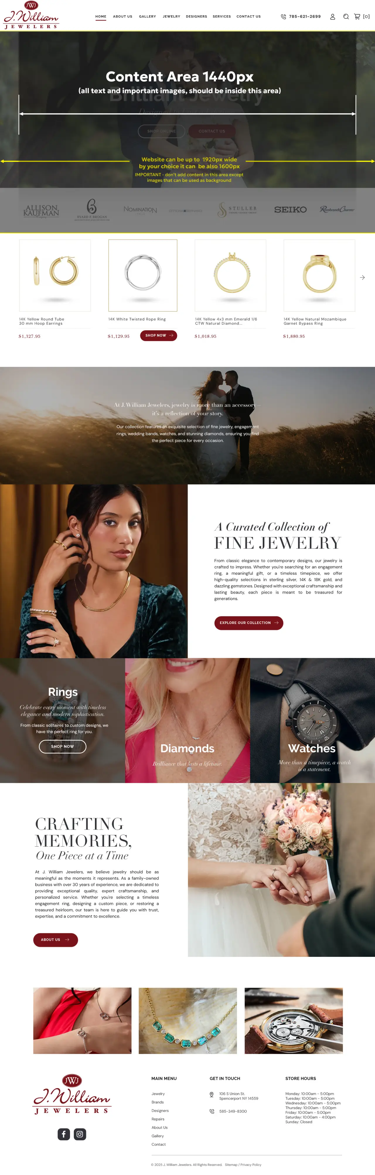
2) Canvas Size & Containers
-
Page canvas width:
-
Preferred: 1600–1920px artboards. Use 1920px if you plan full-bleed imagery; 1600px if you prefer tighter shells.
-
-
Content container (centered):
-
Best practice target: max 1440px for main content rows (readable line lengths), but allow full-bleed sections when needed.
-
Provide a "breakout" style for 100vw rows (hero, banners, carousels).
-
-
Gutters: 24–32px per side on mobile, 32–48px tablet/desktop. Show safe areas.
-
Line length: 60–80 characters ideal for body copy (>18px font).
Tailwind v4 mapping (defaults)
-
Breakpoints:
sm: 640px (40rem),md: 768px (48rem),lg: 1024px (64rem),xl: 1280px (80rem),2xl: 1536px (96rem). -
Container utility:
containercaps at each breakpoint. For a wide layout, use:-
container mx-auto px-4for centered rows -
max-w-[1440px]or a custom token for 1440 content areas -
.breakoutclass (custom) for 100vw sections.
-
3) Grid System
-
12-column grid at desktop, 8 on tablet, 4 on mobile.
-
Column width: Flexible; plan for content in multiples of 4 columns (e.g., 4/12, 6/12).
-
Spacing scale: Use a 4px base (4/8/12/16/24/32/48/64/96). Align paddings/margins to this.
-
Card gutters: 24–32px.
Tailwind classes:
-
Gaps:
gap-4/6/8/12(map to 16/24/32/48px via theme) -
Responsive columns:
grid-cols-1 md:grid-cols-2 lg:grid-cols-3etc.
4) Typography
-
Body size: 16–18px mobile; 18–20px desktop.
-
Scale: Use modular scale (e.g., 1.25 or 1.2). Provide H1–H6 specimens with line-height.
-
Line-height: 1.4–1.6 for body; 1.1–1.3 for headlines.
-
Readability: Keep H1 < ~12 words. Avoid all-caps for long headings.
Tailwind v4 tokens:
-
Define font families and sizes in
@theme(e.g.,--font-sans,--text-xletc.) -
Classes:
text-base,text-lg,text-xl,leading-relaxed,tracking-tight,antialiased.
5) Color & Elevation
-
Palette: 1–2 primary brand colors, 1 accent, neutral gray ramp (50–900).
-
Contrast: Aim for WCAG AA minimum (4.5:1 body text; 3:1 large text/icons).
-
States: Define hover/active/focus colors.
-
Elevation: Limit to 3 shadow levels:
-
Card:
shadow-sm -
Popover:
shadow-md -
Modal:
shadow-xl
-
-
Radii: Prefer
rounded-lg/xl(8–12px). Keep consistent.
6) Buttons & Inputs
-
Sizes:
sm,md,lgwith matching paddings. -
States: default, hover, focus-visible, active, disabled, loading.
-
Focus rings: Always visible via keyboard. Example:
focus-visible:outline,outline-2,outline-offset-2. -
Touch targets: ≥ 44×44px on mobile.
Patterns:
-
Primary: solid brand background, white text
-
Secondary: neutral background/border
-
Tertiary: text-only with underline on hover
7) Navigation & Header
-
Desktop: Sticky header height 64–88px; logo left, primary nav, right-side CTAs. Provide mega menu styles if needed.
-
Mobile: Hamburger → slide/flyout. Provide motion specs.
Tailwind ideas: sticky top-0 z-50 backdrop-blur bg-white/80 for translucent headers.
8) Cards, Lists, and Data Blocks
-
Cards: Image → Title → Meta → Excerpt → CTA. Maintain equal heights.
-
Lists: define iconography, bullet spacing.
-
Product tiles: support price, sale badge, rating, color swatches.
Tailwind: aspect-[4/3], object-cover, line-clamp-2/3 for text truncation.
9) Media & Imagery
-
Aspect ratios: 16:9 hero, 4:3 cards, 1:1 avatars.
-
Exports:
-
Raster: WebP/JPG at 1x & 2x (e.g., 1440 & 2880 for full-width content image). Compress to < 200KB when possible.
-
Vector: SVG for logos/icons/illustrations.
-
-
Lazy load below the fold; blur-up placeholders optional.
10) Accessibility (A11y)
-
Keyboard nav order defined; skip-to-content link.
-
Focus states visible and distinct from hover.
-
Color contrast AA; test dark-on-light and light-on-dark.
-
Alt text for images; descriptive link labels.
-
Motion preferences respected (
prefers-reduced-motion).
11) Performance
-
Prefer SVG over PNG for flat artwork.
-
Avoid full-bleed 4K unless necessary; cap hero images to ~2560px with proper compression.
-
Limit web fonts (≤ 2 families, ≤ 4 weights). Use
display=swapand subset.
12) Tailwind v4 Specifics for Designers
-
Tokens via
@theme: Devs define spacing, colors, fonts as CSS variables (e.g.,--spacing,--color-primary). Use consistent values in your spec. -
Breakpoints: Plan sections that adapt at
sm/md/lg/xl/2xl(see §2 mapping). Supply comps for mobile (375/390), tablet (768/834), desktop (1280/1440), and wide (1600/1920). -
Containers:
-
Default Tailwind
containercaps at breakpoints (up to 1536px). -
If your design uses 1440px content width, call it out. Devs can use
max-w-[1440px]or define a token like--container-1440. -
Specify which sections are full-bleed vs. constrained.
-
-
Container queries: Optional patterns that adapt components by parent width using
@container.