Choosing the Perfect Google Authorship Headshot
Your Google Authorship photo, inevitably, will have an impact on how frequently (or infrequently) your website gets visited. For many users, especially those who follow Google's webmaster guidelines implicitly, Google+ photos have become the source of some confusion. The Question is, Why does Google seem to be so indecisive in how they want these head shots presented by the user?
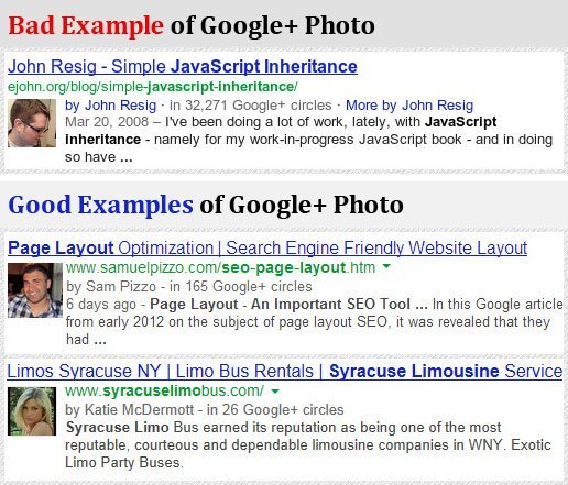
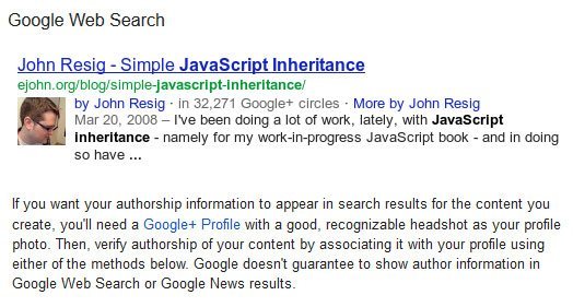
In the photo upload section of Google+ Authorship, they specifically instruct users to select a good recognizable headshot. Why is it then, that the example Google+ authorship image Google uses, shows only half of a person's face? This is yet another example of Google sending mixed messages based on their own lackluster examples.
You will get a better CTR (Click Through Rate) if your website uses Google+ Authorship.

In any other instance, this might be considered knit-picking; but Google isn't any other company. They need to understand that in the do-or-die SEO environment they've created, there will always be those who follow the examples they use. Better pages means better instructions, and this starts and ends with the examples they present.
When selecting a photo for your Google+ Authorship, be sure to choose an image that:
- Is clear and free of design elements
- Shows your whole face, not just a profile
- Clean resolution and undistorted
- Professional or authoritative
- Representative of the topic you're covering
If you run a business or manage a blog, and are not using Google Authorship to promote your services, you'll always remain one step behind your competition. For more information on the advantages of Google+ or to get started on your page, call Sam Pizzo Web Design today for a free consultation.


