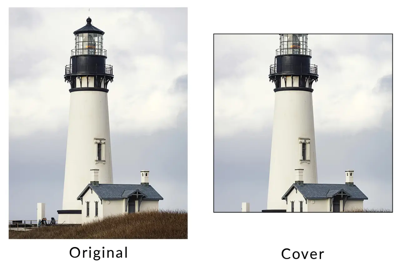
Cover fills the frame
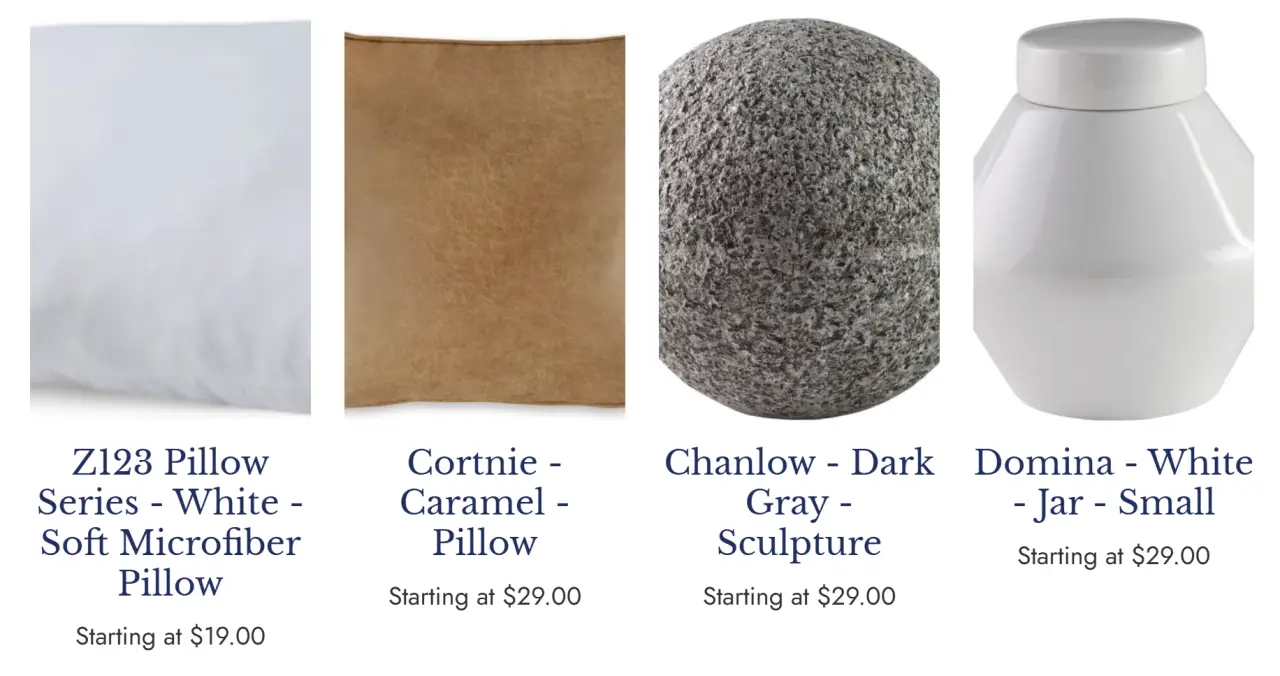
Cover scales the image until the frame is filled. It creates a strong, uniform grid but can crop the top, bottom, or sides.
eCommerce visual merchandising
Create a consistent product grid without forcing every catalog image into the same crop.
CMS Max separates the image frame from the image fit. Choose a site-wide aspect ratio for the storefront grid, then use Cover for edge-to-edge merchandising or Contain when the complete product must remain visible.
Operating model
The right setting depends on whether edge-to-edge visual consistency or complete object visibility is more important for the catalog.
Cover scales the image until the frame is filled. It creates a strong, uniform grid but can crop the top, bottom, or sides.
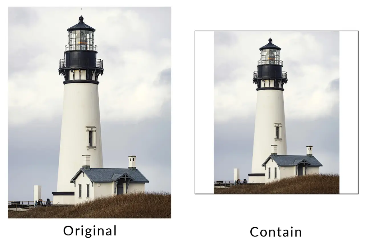
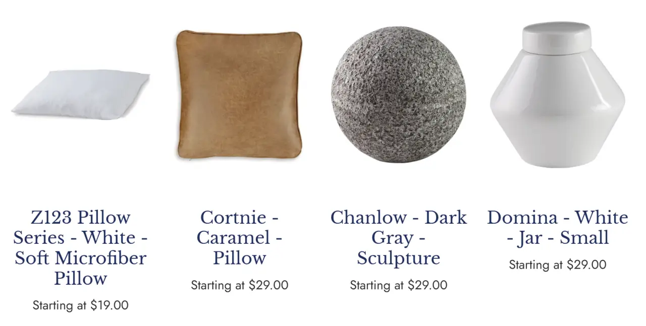
Contain scales the complete image inside the frame. It avoids cropping and can leave open space around products with different proportions.
The ratio controls the product-grid image area independently of fit. Pick the ratio that matches the dominant source photography and merchandise.
Current CMS Max capability
Configure these options under eCommerce > Store Settings > Features > Product Images. Changes apply to the storefront product grid that reads these settings.
A balanced landscape frame for wider products, room scenes, equipment, and photography with moderate horizontal composition.
A wider photographic frame suited to products consistently shot in a traditional landscape orientation.
The current default frame and a dependable choice for mixed catalogs, marketplaces, apparel, packaged goods, and compact grids.
A moderate portrait frame for apparel, bottles, wall art, people, and products with meaningful vertical detail.
A taller frame for fashion and vertical merchandise when the catalog photography consistently supports it.
Choose Cover or Contain as the default object fit so product cards remain visually coherent as the catalog grows.
Step-by-step workflow
A good default survives portrait and landscape sources, transparent backgrounds, long product names, mobile grids, and real category pages.
Group source images by orientation, whitespace, background, crop tolerance, and product category.
Select the aspect ratio that best matches the dominant catalog and storefront density.
Use Cover for filled merchandising frames or Contain when cropping could hide important product detail.
Inspect category pages, search results, product cards, mobile two-column grids, and the most irregular source images.
Create photography standards for new products and improve outliers instead of relying on one CSS setting to repair inconsistent source media.
Practical reference
These existing CMS Max examples remain useful because they show the practical crop and whitespace tradeoff.


Current references
Interfaces, policies, plans, services, pricing, and requirements can change. Verify the current CMS Max configuration and official provider sources during implementation.
Product Photo Display Options FAQ
Turn each answer into configuration, representative testing, monitoring, ownership, and a documented recovery path.
Open eCommerce > Store Settings, choose Features, and expand Product Images.
The current CMS Max setting defaults to Square 1:1. Existing tenants may have a different stored choice.
Cover preserves the image proportions while scaling. It fills the frame by cropping overflow rather than distorting the source.
Contain keeps the complete source image visible. When source proportions differ from the selected frame, the remaining frame area stays open.
No. The setting creates a predictable display rule, but strong ecommerce catalogs still need consistent framing, backgrounds, resolution, lighting, and crop-safe source images.
Build for real operations
CMS Max combines image settings, product data, responsive storefront components, search, categories, checkout, and integrations in one ecommerce platform.
The world's fastest and most SEO friendly website code.